Understanding Long-Term Market Trends and Cycles
Overview
This handbook aims to help traders and investors identify the current stage in a long-term market cycle.
For this purpose, we will use a layout with five charts with key indicators. We will use BTC as a proxy.
Key indicators are:
- Spikes in age consumed
- Changes in mean dollar age
- Divergence between MVRV and price
- Profit and loss levels
- Social volume trends
Open this layout with five charts and let’s dive in:
Sanbase Charts | Long-term market cycle
Age Consumed
The key metric on chart 1 of the layout is age consumed, which represents amounts of coins that moved multiplied by the time that they spent at the last address. Large spikes of this metric mean that long-term holders are moving their funds, which often marks key turning points for the market.
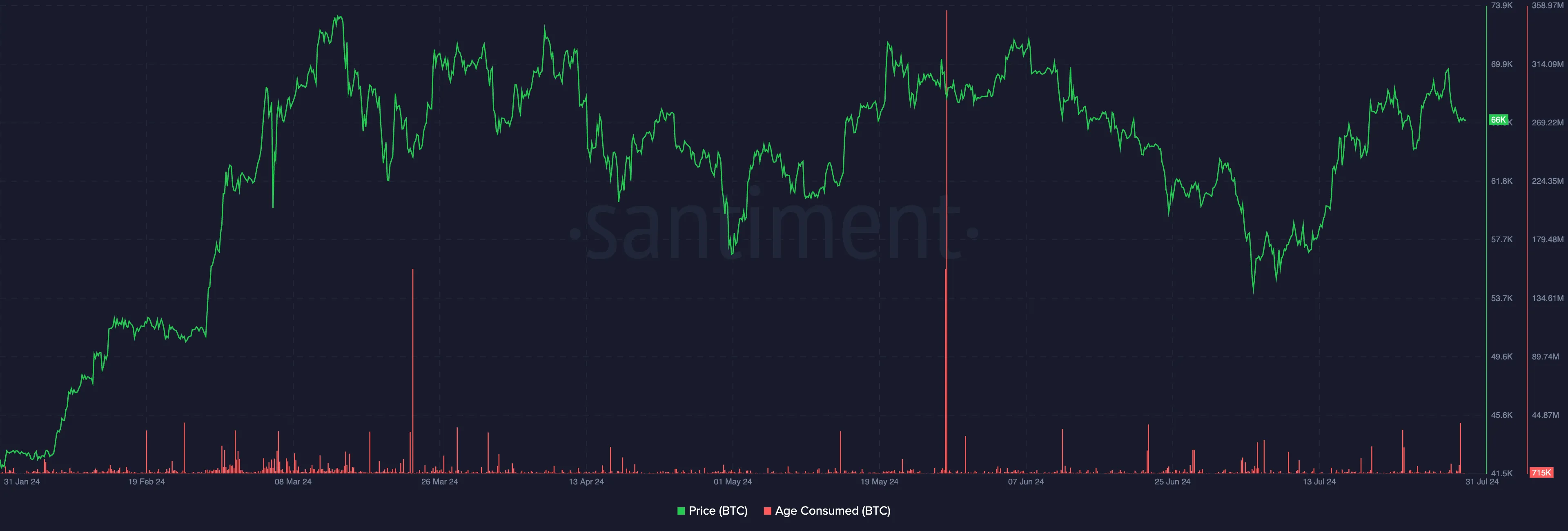
Age Consumed - the number of coins changing addresses on a certain date, multiplied by the time since they last moved.
Identify critical market turning points by monitoring significant spikes.
Spikes indicate long-term holders moving their funds, often signalling major market shifts.
Mean Dollar Invested Age (MDIA)
On chart 2 of the layout, you can see mean dollar age metrics, one of which measures this value for all coins, while the other one only looks at coins moved within the last 365 days. These metrics help gauge the macro trend strength. When the value drops, that indicates an inflow of new money, and the inverse indicates that money isn’t coming in. These metrics usually start falling around the middle of the bull market, acting as a confirmation of strength. A change of mode from down to up often predicts major market tops.
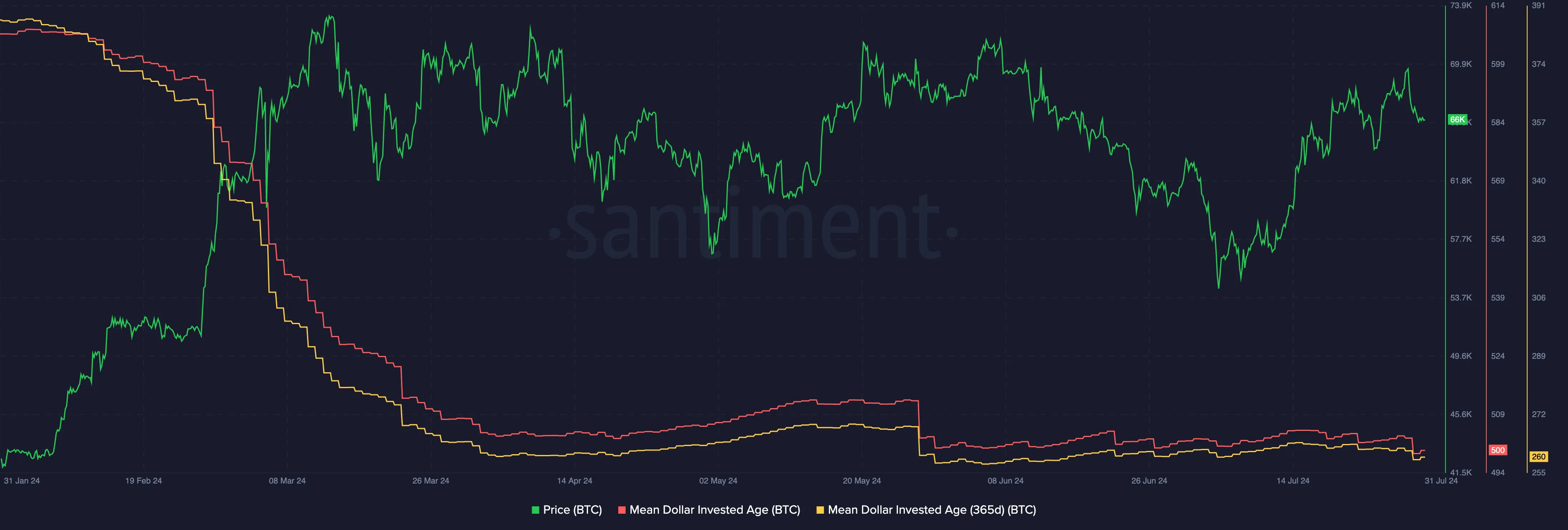
MDIA - the average age of every dollar invested into the market cap of a coin.
Gauge the strength of the macro trend using two MDIA metrics: one for all coins and one for coins moved within the last 365 days.
Changes in these metrics from downward to upward trends signal macro trend exhaustion.
Dropping values show an inflow of new money, typically post-bull market midpoint, confirming market strength.
Rising values show a lack of new money, often predicting major market tops.
MVRV Ratio
Chart 3 of the layout has MVRV ratios (Market Value to Realized Value) with different timeframes. Here, the same idea of coins moved within a specific time applies. The key idea here is to look for divergences between MVRV and price. MVRV diverging from price can only be caused by the change in realized value. When realized value rises, that means on average market participants are buying in at the highs, indicating “greed” mode of the market, and price tends to trend down as a result. The opposite applies as well. When participants are selling at the lows and realizing losses, the realized value drops and that causes MVRV ratio to diverge to the upside.
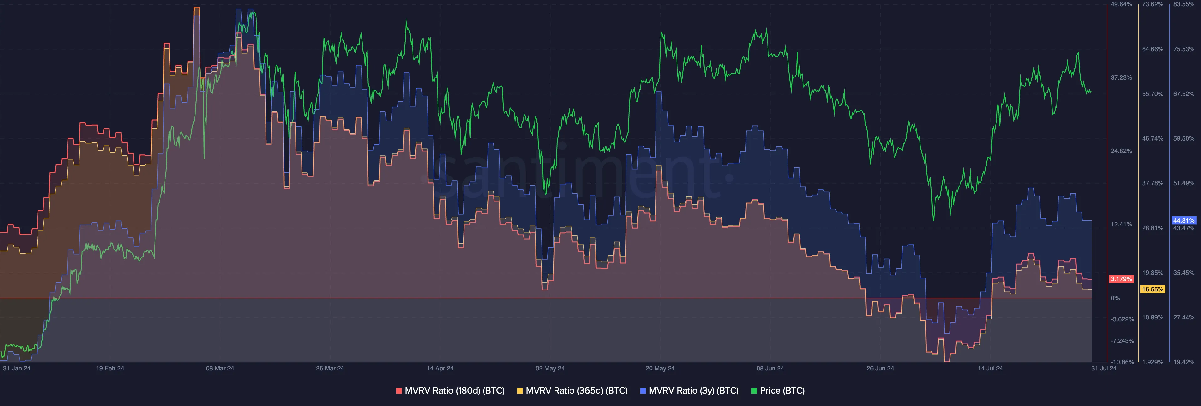
MVRV Ratio - an asset’s market capitalization divided by realized capitalization.
Observe divergences between MVRV and price by analyzing MVRVs for different timeframes based on coin movements.
Rising Realized Value indicates “greed,” often leading to a downward trend.
Dropping Realized Value indicates losses, causing MVRV to diverge upwards.
Divergences reveal market sentiment and potential price movements.
Network Realized Profit and Loss
Network Realized Profit/Loss on chart 4 of the layout measures the collective PnL of all holders. Big negative spikes are usually the best long-term buy signals. Spotting the tops, however, works a bit differently - the biggest spikes happen around mid-bull market. But after that, when the price continues higher but NRPL stays close to 0, this usually means that the market’s top is near.
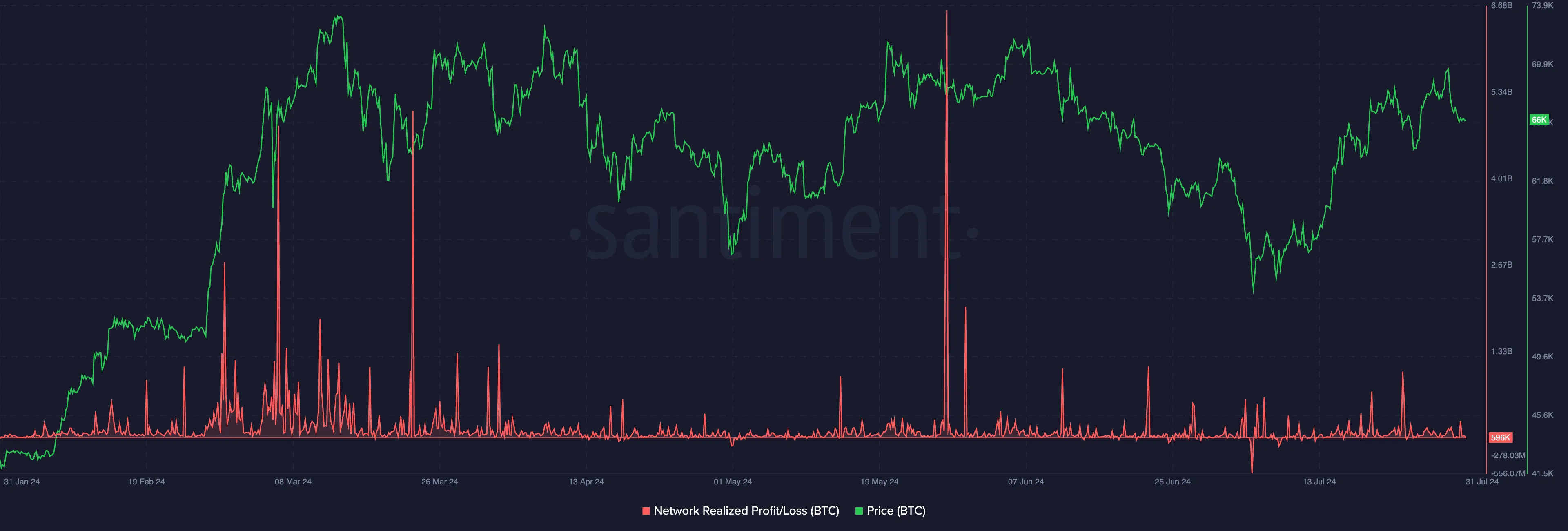
Network Realized Profit/Loss - the average profit or loss of all coins that change addresses daily.
Identify optimal buying opportunities and potential market peaks.
Big negative spikes indicate the best long-term buy signals. Mid-bull market spikes signify significant profit-taking. Price rising with NRPL near 0 suggests an approaching market top.
Social Volume
Social volume on panel 5 indicates the amount of discussion in crypto social media. You generally want to get in when the amount of chatter is low, and the average Joe isn’t interested in crypto at all, but when everyone is only talking about Bitcoin, it’s best to consider an exit or partial profit-taking strategy.
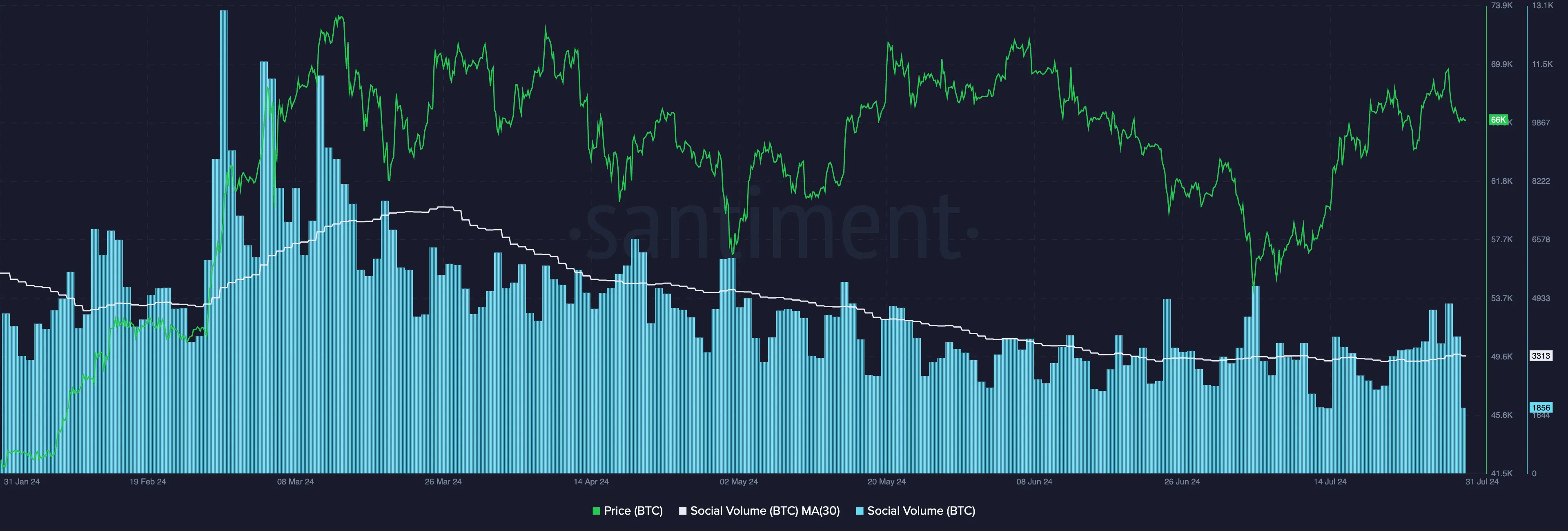
Social Volume - the total number of social media messages that contain the given search term at least once.
Effectively time market entries and exits by monitoring social volume.
Low chatter periods are ideal entry points when interest in crypto is minimal. High chatter signals that it’s time to consider your exit strategy as interest peaks.
All of these metrics will help you better understand the crypto market trends on a macro level and make more informed decisions.
Sanbase Charts | Long-term market cycle
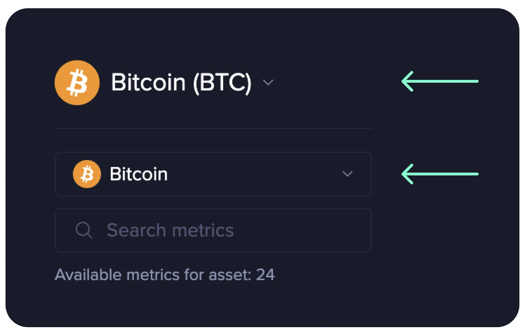
Feel free to save the layout with charts as your own and use the master selector (the top one) to observe the same metrics for various tokens.
See what others in crypto can’t!